How to Design Halloween-Themed Flexible Packaging
Anna_Yu
How to Design Halloween-Themed Flexible Packaging
Halloween has evolved from a traditional holiday into a major seasonal shopping opportunity for confectionery brands, snack manufacturers, specialty food businesses, cosmetics companies, toy brands, and retailers. Every year, consumers look for products that deliver more than functional value. They want memorable designs, festive colors, playful characters, limited-edition experiences, and packaging that makes seasonal products feel special. In this competitive environment, Halloween-themed flexible packaging gives brands an effective way to capture attention, communicate seasonal identity, and create a stronger connection with customers.
From candy bags and chocolate pouches to Halloween snack packs, cookie packaging, coffee bags, pet treat pouches, and promotional gift packaging, flexible packaging offers extensive customization possibilities. Brands can experiment with orange-and-black color schemes, spooky illustrations, pumpkin graphics, ghost characters, creative typography, metallic effects, transparent windows, and distinctive bag shapes. At the same time, packaging must continue to perform its essential functions: protecting products, maintaining freshness, supporting efficient filling and sealing, and withstanding transportation and retail handling.
Designing successful Halloween packaging therefore requires more than adding a few pumpkins or bats to an existing design. The most effective solutions combine seasonal visual appeal, brand consistency, product-specific material selection, convenient packaging features, and a clear marketing strategy. A design that looks attractive on a computer screen may not reproduce accurately during printing, stand out on a crowded retail shelf, or remain practical for automated production. Similarly, a visually striking package may fail to deliver value if it does not provide the barrier performance required by the product inside.
This guide explores how to design Halloween-themed flexible packaging that balances creativity with commercial performance. It examines the design elements that make seasonal packaging recognizable, explains how colors, graphics, and typography influence consumer perception, compares suitable materials and bag styles, and discusses how customized packaging can strengthen brand recognition and support seasonal campaigns. It also covers practical considerations such as artwork preparation, print finishes, packaging functionality, production timelines, sustainability, and distribution.
Whether you are launching a limited-edition candy collection, refreshing an existing snack line, or developing custom packaging for a Halloween promotion, the goal is the same: create packaging that attracts attention, protects the product, reinforces brand identity, and makes the seasonal buying experience more memorable.
1. What Design Elements Make Halloween Flexible Packaging Stand Out?
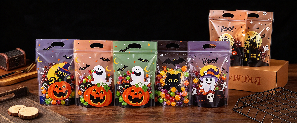
Halloween packaging has a distinctive visual language. Pumpkins, ghosts, bats, black cats, skeletons, haunted houses, cobwebs, and moonlit landscapes are instantly associated with the holiday. However, using familiar symbols does not automatically produce effective packaging. Successful designs combine these recognizable elements with a clear visual hierarchy, product-specific messaging, and a distinctive brand identity.
The first step is to determine what the package should communicate within a few seconds. Is the product playful and family-friendly, dark and mysterious, premium and sophisticated, or humorous and unconventional? The answer should guide the selection of illustrations, colors, typography, finishes, and layout.
Start with a Clear Halloween Theme
A cohesive theme makes packaging easier to recognize and helps consumers understand the product's seasonal positioning. Rather than combining every Halloween symbol in one design, select a small group of elements that work together.
For example, a candy brand targeting children might use smiling ghosts, colorful pumpkins, friendly monsters, and rounded lettering. A premium chocolate brand might prefer black backgrounds, restrained orange accents, elegant gold details, and sophisticated illustrations. A snack brand targeting young adults could use bold lettering, comic-style graphics, or retro horror-inspired artwork.
The following table outlines several possible creative directions.
| Halloween Design Theme | Main Visual Elements | Suitable Products | Brand Impression |
|---|---|---|---|
| Cute and playful | Smiling ghosts, friendly pumpkins, cartoon bats | Candy, gummies, cookies, children's snacks | Fun, approachable, family-friendly |
| Classic spooky | Haunted houses, moonlight, cobwebs, silhouettes | Chocolate, confectionery, seasonal snacks | Traditional Halloween atmosphere |
| Dark and premium | Black backgrounds, refined line art, metallic accents | Premium chocolate, coffee, specialty treats | Sophisticated and exclusive |
| Retro Halloween | Vintage illustrations, distressed lettering, muted orange and cream | Cookies, gift snacks, limited editions | Nostalgic and distinctive |
| Bold and humorous | Oversized graphics, exaggerated expressions, playful slogans | Chips, popcorn, novelty candy | Energetic, youthful, entertaining |
| Minimalist seasonal | Simple icons, limited colors, generous negative space | Premium food, wellness products, gift packs | Modern, clean, design-led |
The theme should match both the product and its intended audience. A highly detailed haunted-house illustration may be appropriate for premium seasonal chocolate, but it may be less effective on a small single-serving candy sachet where limited space demands immediate recognition.
Use a Strong Visual Hierarchy
Visual hierarchy determines what consumers notice first, second, and third. For most retail packaging, the primary message should be clear before consumers inspect small details.
A practical hierarchy for Halloween flexible packaging is:
- Brand identity: The brand name or recognizable logo.
- Product identity: What the product is, such as chocolate, gummies, cookies, or popcorn.
- Halloween theme: The seasonal artwork, color palette, and limited-edition cues.
- Key product benefit: A relevant message such as a flavor description, texture claim, or pack format.
- Supporting information: Net weight, ingredients, instructions, and required labeling.
The exact order depends on the brand's marketing strategy. For a limited-edition product, the Halloween theme may occupy a more prominent position, but it should not make the product difficult to identify.
A package covered with large illustrations, slogans, decorative patterns, and multiple typefaces can become visually confusing. Instead, establish one dominant focal point and allow the other elements to support it.
For example, a stand-up pouch containing pumpkin-flavored cookies might feature a large pumpkin illustration near the center, the brand logo at the top, and the product name directly below. Small bats or stars can provide atmosphere without competing with the main message.
Create a Memorable Main Illustration
Illustrations often carry the emotional impact of Halloween packaging. They can make the package feel friendly, mysterious, funny, elegant, or slightly frightening without changing the product itself.
Common illustration approaches include:
- Character-based artwork: Ghosts, witches, pumpkins, skeletons, or monsters with distinctive expressions.
- Scene-based artwork: Haunted houses, graveyards, forests, moonlit skies, or trick-or-treat settings.
- Pattern-based artwork: Repeating bats, tiny pumpkins, stars, cobwebs, or candy shapes.
- Product-integrated artwork: A chocolate bar shaped like a tombstone in the illustration, cookies arranged like pumpkins, or candy depicted as part of a spooky scene.
- Abstract seasonal graphics: Geometric shapes, irregular lines, silhouettes, and stylized symbols that evoke Halloween without using literal characters.
A consistent illustration style is essential. Combining realistic photographs, flat cartoon characters, and intricate vintage engraving in the same design can make the package feel disjointed unless the contrast is intentional.
Make the Product Visible When Visibility Adds Value
Transparent windows can be useful when the product's appearance helps sell it. A window may reveal colorful gummies, individually wrapped candies, cookies, snack mixes, or decorative treats.
However, transparency should be considered a functional design choice rather than an automatic requirement. Light-sensitive products, products requiring stronger barrier protection, or items that benefit from a fully printed premium appearance may be better suited to opaque packaging.
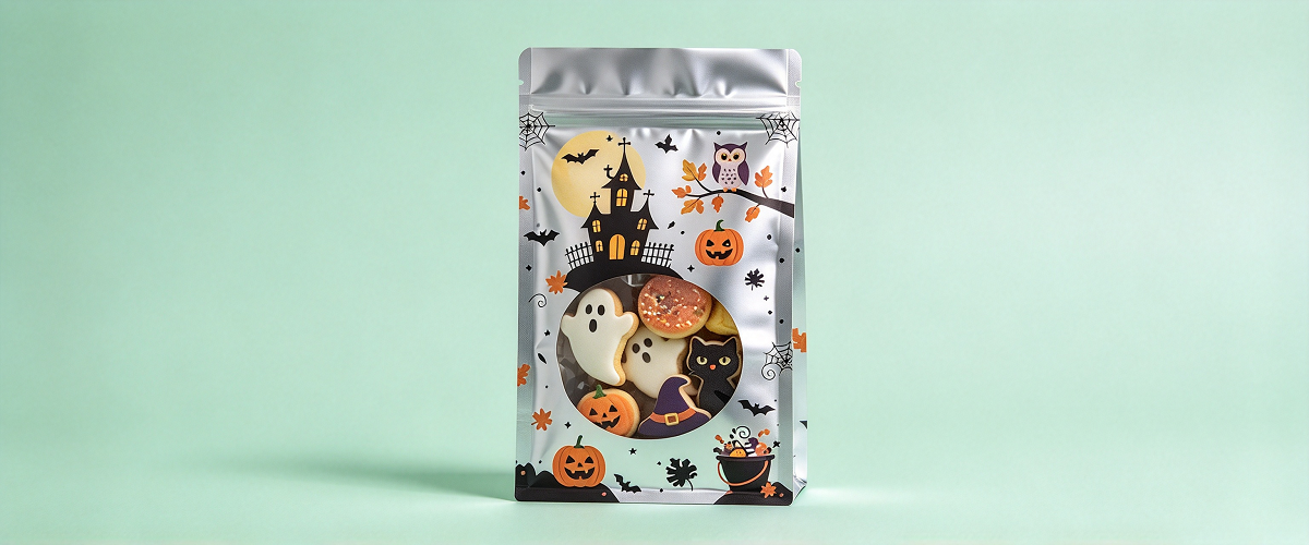
If a window is included, its size and placement should balance product visibility with protection and artwork. A pumpkin-shaped window, for example, can reinforce the seasonal theme while allowing consumers to see the candy inside. The window film and surrounding laminate must still meet the product's barrier, sealing, and food-contact requirements.
Use Finishes to Add Depth and Seasonal Appeal
Surface finishes can enhance the visual impact of Halloween packaging, especially when used selectively.
Popular options include:
- Matte finish: Creates a smooth, understated appearance and can suit premium or minimalist designs.
- Gloss finish: Enhances color intensity and creates a bright, polished look.
- Spot UV: Adds localized gloss to selected elements such as a ghost illustration, pumpkin eyes, or the brand logo.
- Metallic effects: Add a reflective accent to lettering, stars, moon details, or decorative borders.
- Soft-touch finishes: Create a tactile experience that may suit premium gift packaging.
- Textured visual effects: Simulate rough paper, aged surfaces, or vintage print styles through artwork and suitable finishing techniques.
These finishes should support the concept rather than overwhelm it. Applying several effects across the entire package can increase cost without necessarily improving shelf appeal.
It is also important to distinguish between a metallic ink, a printed metallic effect, and a physical metallic layer. They produce different visual results and may have different production and recycling implications. The final choice should be confirmed with the packaging supplier before artwork is finalized.
Design for Shelf Recognition and Digital Shopping
Halloween packaging must work in more than one environment. In physical retail, consumers may see packages from a distance among competing seasonal displays. In e-commerce, the package may first appear as a small thumbnail on a phone screen.
This creates two related design requirements.
First, the package needs a recognizable silhouette of color, shape, and artwork. Second, the most important information must remain readable when the design is viewed at a reduced size.
A detailed illustration may look impressive at full resolution but disappear into visual noise when reduced to a small online image. Strong shapes, simple contrast, readable product names, and a clear focal point are often more effective.
Before approving the final design, review it in three ways:
- At full size to inspect details and typography.
- At typical retail viewing distance to evaluate visibility.
- As a small digital thumbnail to assess online recognition.
This process helps identify design problems before expensive printing begins.
Keep Seasonal Creativity Consistent with the Brand
Halloween packaging should feel special without becoming disconnected from the brand's existing identity. Established brands can retain recognizable logo placement, signature colors, typography, and visual motifs while adding seasonal illustrations and accents.
A useful approach is to preserve the brand's core visual elements and introduce Halloween through a controlled set of changes. For example, a brand known for cream-colored packaging might introduce a dark background for a limited edition while retaining its logo, product name style, and familiar layout.
This allows consumers to recognize the brand immediately while understanding that the product is part of a seasonal collection.
2. How Can Colors, Graphics, and Typography Create an Eye-Catching Halloween Packaging Design?
Color, graphics, and typography are the main tools used to communicate a Halloween theme. Each has a different role: color creates atmosphere, graphics establish the visual story, and typography communicates the product and brand message.
The strongest designs coordinate these elements rather than treating them as separate decorative layers.
Choose a Color Palette with a Clear Purpose
Orange and black are classic Halloween colors, but they are not the only options. Purple, green, white, cream, red, and metallic shades can introduce different moods and help brands differentiate their products.
| Color | Common Halloween Association | Potential Packaging Use |
|---|---|---|
| Orange | Pumpkins, autumn, energy | Main seasonal accent, pumpkin graphics, highlights |
| Black | Mystery, night, sophistication | Backgrounds, silhouettes, premium designs |
| Purple | Fantasy, magic, imagination | Candy packaging, magical characters, playful themes |
| Green | Monsters, potions, supernatural effects | Accent colors, character details, novelty products |
| White | Ghosts, contrast, simplicity | Ghost illustrations, lettering, minimalist layouts |
| Red | Drama, intensity, danger | Limited accents for dramatic or horror-inspired concepts |
| Cream | Nostalgia, warmth, vintage aesthetics | Retro packaging, artisan sweets, premium designs |
| Gold or silver | Celebration, refinement, special editions | Foil-like accents, premium details, limited-edition cues |
The most suitable palette depends on the brand's positioning and product category. A children's candy pouch may benefit from bright orange, purple, and green, while a premium chocolate pouch may use black, cream, and restrained metallic accents.
Apply the 60–30–10 Principle as a Starting Point
A useful design guideline is to divide the visual area into three approximate color roles:
- 60% dominant color: The main background or largest visual area.
- 30% secondary color: A supporting color used in illustrations, panels, or large text.
- 10% accent color: A bright shade reserved for key highlights and calls to attention.
This is not a strict rule. A graphic-heavy design may require a different balance, but the principle helps prevent too many colors from competing for attention.
For example, a black pouch could use black as the dominant color, orange as the secondary color, and purple as a small accent. The orange could carry the main illustration, while purple highlights selected details or a limited-edition message.
For a brighter children's design, cream or white might serve as the background, with orange and purple used for characters and green reserved for small accents.
Use Contrast to Improve Readability
A visually exciting palette is not useful if consumers cannot read the product name. Contrast between the text and its background should remain strong enough to support quick recognition.
White lettering on a dark background, black lettering on a light background, or orange lettering on a carefully selected contrasting area can work well. However, color combinations should be evaluated in the actual print context rather than on a backlit monitor alone.
Fine orange text on black may appear striking at large sizes but become difficult to read when printed small. Similarly, thin purple lettering over a complex illustration may disappear at retail distance.
To reduce these risks:
- Keep product names large enough for the final pouch size.
- Avoid placing essential text over busy illustrations.
- Use solid or quieter background areas behind key messages.
- Check small text, ingredient information, and barcode areas separately.
- Review a physical proof when color accuracy and legibility are critical.
Use Graphics to Tell a Seasonal Story
Halloween graphics can do more than decorate a package. They can explain the product concept, create a sense of fun, and help consumers imagine the experience associated with the product.
For instance, a candy pouch could show friendly ghosts collecting sweets, while a cookie pouch could depict a pumpkin-shaped house surrounded by autumn leaves. A spicy snack package might use exaggerated monster illustrations and energetic shapes to communicate intensity.
The graphic concept should connect to the product whenever possible. If the package contains strawberry gummies, the design can combine Halloween characters with visible strawberry imagery or a clearly stated flavor. This helps consumers understand what they are buying instead of relying on seasonal visuals alone.
Balance Graphic Density with Negative Space
Negative space is the area that remains relatively free of text and imagery. It gives important elements room to stand out and can make a design appear more polished.
Halloween themes often encourage designers to add bats, spiders, pumpkins, stars, moons, candy, and decorative patterns. Used together without a clear structure, these elements can crowd the package.
A more controlled approach is to select one primary illustration, one secondary graphic system, and a limited set of decorative details. For example:
- Primary: A large smiling ghost holding candy.
- Secondary: Small pumpkin icons around the lower edge.
- Decorative: A few stars or cobweb lines in the background.
The result can still feel festive while keeping the brand name and product information visible.
Choose Typography That Matches the Brand Personality
Typography can make the same Halloween illustration feel cute, frightening, nostalgic, or premium.
Common approaches include:
- Rounded display fonts: Friendly and approachable, suitable for children's products.
- Handwritten fonts: Informal, playful, or craft-inspired.
- Distressed fonts: Suitable for vintage or horror-inspired concepts.
- Bold geometric fonts: Strong visibility for energetic snack products.
- Elegant serif fonts: Suitable for premium chocolate, specialty foods, or refined limited editions.
- Condensed display fonts: Useful when space is limited, provided the type remains readable.
A common mistake is using a highly decorative font for every line. This reduces readability and makes the package appear crowded.
A practical hierarchy is to use one expressive display font for the Halloween headline or product name, a complementary font for supporting messages, and a highly readable font for product details and required information.
Make the Product Name More Prominent Than Decorative Copy
Seasonal slogans such as “Trick or Treat,” “Spooky Bites,” or “A Little Halloween Magic” can strengthen the theme, but they should not obscure the product identity.
A consumer should not have to guess whether a package contains chocolate, gummies, popcorn, cookies, or another product. The product name should be prominent, and the flavor or variant should be easy to locate.
If the product is a limited edition, a short seasonal label can provide additional context. For example, “Halloween Limited Edition” may be more informative than an ambiguous decorative phrase.
Use Typography Consistently Across a Seasonal Collection
When a brand launches several Halloween flavors or pack sizes, consistent typography helps the products look like one collection.
The brand logo, product-name position, and supporting text style should remain reasonably consistent. Color and illustrations can change to distinguish flavors or variants.
A coordinated range might include:
- Orange packaging for pumpkin-spice cookies.
- Purple packaging for berry gummies.
- Black packaging for dark chocolate treats.
- Green accents for sour candy.
The overall structure remains recognizable, while each product has its own visual identity.
Consider Accessibility and Legibility
Seasonal packaging still needs to communicate essential information clearly. Low contrast, overly decorative lettering, and small type can make packaging difficult to use, particularly for consumers with reduced vision.
Keep important information readable and avoid communicating flavor, allergen, or product distinctions through color alone. Use clear wording and appropriate visual cues.
Required labeling should be reviewed according to the markets where the product will be sold. Design creativity does not replace applicable food-labeling or consumer-information requirements.
Evaluate Color Reproduction Before Full Production
The colors displayed on a computer monitor may differ from those produced on a printing press. The final appearance depends on the printing process, substrate, ink system, lamination, surface finish, and the way light interacts with the material.
This is particularly important for Halloween packaging because vivid orange, deep black, neon-like green, and saturated purple may be central to the design.
Before mass production, brands should confirm:
- Whether the chosen colors can be reproduced consistently.
- How the artwork looks on the actual packaging material.
- Whether lamination changes the perceived color or gloss.
- Whether small graphic details remain clear after printing.
- Whether the design is consistent across multiple SKUs.
A printed proof or production-representative sample is a more reliable basis for approval than a digital mockup alone.
3. Which Flexible Packaging Materials and Bag Styles Are Best for Halloween Products?
Halloween packaging must combine appearance with practical performance. The right material and bag style depend on the product being packed, its moisture and oxygen sensitivity, fat content, expected shelf life, filling equipment, distribution environment, and desired presentation.
A candy pouch, a bag of potato chips, a chocolate gift pack, and a Halloween-themed cosmetic sample may all use flexible packaging, but they do not necessarily require the same structure.
The design should therefore begin with the product and its protection needs. Once the technical requirements are understood, the brand can choose a bag format and customize its appearance.
Stand-Up Pouches for Retail-Ready Seasonal Products
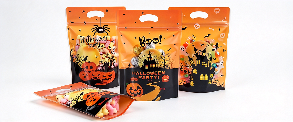
Stand-up pouches are a versatile option for many Halloween products, especially candy, gummies, cookies, snack mixes, nuts, and pet treats.
Their flat front panel provides room for seasonal artwork, product information, and brand messaging. The bottom gusset helps the pouch stand upright on shelves, making it useful for retail displays and seasonal promotional sets.
Possible customization options include:
- Resealable zipper closures.
- Tear notches for convenient opening.
- Gloss or matte finishes.
- Printed seasonal illustrations.
- Transparent windows where product visibility is appropriate.
- Different pouch sizes for single-serve, family-size, or gift-oriented products.
A zipper can be particularly useful for products consumed over several occasions. However, the package should not be assumed to remain fully airtight after repeated opening. The closure should be selected according to the intended use and freshness requirements.
Flat-Bottom Bags for Premium Halloween Collections
Flat-bottom bags provide a structured appearance and a broad display area. They can be suitable for premium chocolate, specialty candy, coffee, nuts, and seasonal gift products.
The format offers multiple printable panels, allowing brands to separate the main visual identity from product details, storytelling, and regulatory information. The squared base can also support a more substantial shelf presence.
For premium Halloween collections, designers might use:
- A dark background with restrained metallic details.
- A large central illustration.
- A consistent brand panel.
- A limited-edition message.
- A coordinated design across several flavors or product weights.
Flat-bottom bags may involve different production requirements and costs from simpler pouch formats. Brands should confirm the required dimensions, fill volume, stability, closure options, and manufacturing feasibility before finalizing the design.
Pillow Bags for High-Volume Candy and Snacks
Pillow bags are commonly used for high-volume packaged snacks and confectionery. Their relatively simple construction can suit automated packing operations and cost-sensitive seasonal products.
They are worth considering for individually packed sweets, small snack portions, candy assortments, and products intended for distribution through convenience stores or seasonal promotional channels.
Because the front and back panels often provide the primary printable surfaces, the artwork should be organized to suit the bag's forming and sealing layout. Designers must also account for seal areas, print registration, and the position of product information.
Pillow bags are not automatically resealable. If the product is intended for multiple servings, another format or a suitable closure feature may be more appropriate.
Three-Side-Seal Bags for Samples and Small Portions
Three-side-seal pouches are useful for small product portions, trial packs, samples, and promotional items. Their compact format can be suitable for Halloween candy samples, powdered drink mixes, single-serving treats, and certain non-food products.
The design must work within a smaller printable area. A simple seasonal icon, concise product name, and strong brand mark are often more effective than a highly detailed scene.
Three-side-seal bags can also be used as inner packs within a larger Halloween gift set. In this situation, the outer package can carry the full seasonal theme while the inner packs use simplified designs to identify the product or flavor.
Sachets and Stick Packs for Single-Serve Products
Sachets and stick packs can support Halloween promotions involving instant drinks, powdered mixes, small portions of candy powder, and other suitable products.
Their long, narrow or compact shapes require a different approach to artwork. Designers should prioritize a clear logo, concise product identification, and one strong seasonal visual rather than trying to reproduce a full-size package layout.
For multi-pack retail sets, individual sachets can use a coordinated color system to distinguish flavors while retaining the same Halloween design language.
Side-Gusseted Bags for Larger Packs
Side-gusseted bags can be considered for larger-volume snacks, coffee, and selected specialty products. Their expanded side panels provide capacity while allowing the front to remain relatively clean.
For Halloween use, the front panel can carry the main seasonal design, while the side panels provide additional artwork, product information, or brand storytelling.
Their suitability depends on the filling and sealing equipment, bag dimensions, product weight, and required barrier performance. Brands should also confirm how the filled bag will stand, stack, or fit into retail displays.
Vacuum Pouches for Products That Require Reduced Oxygen
Some Halloween products may require vacuum packaging or another form of oxygen management, depending on their composition and storage needs. In those cases, the package must be designed around the product's actual preservation requirements rather than the seasonal theme.
Vacuum packaging may be relevant to selected food products, but it is not necessary for every Halloween item. For candies, dry snacks, and many confectionery products, an appropriate sealed high-barrier pouch may be more suitable.
Vacuum packaging can also affect the appearance of the product by compressing it. That matters when the package is intended to display fragile or decorative food items.
Compare Material Structures According to Product Needs
Flexible packaging may use several layers to combine printability, mechanical strength, barrier performance, and reliable sealing. The appropriate structure depends on the product and the performance target.
Common material options include PET, BOPP, PE, CPP, metallized films, and aluminum foil. These materials are not interchangeable in every application.
| Material or Structure | Potential Advantages | Common Considerations | Possible Halloween Applications |
|---|---|---|---|
| PET-based laminate | Good print presentation and mechanical strength | Final barrier and sealing properties depend on the complete laminate | Printed candy, cookie, and snack pouches |
| BOPP-based structure | Lightweight and useful for many snack applications | Suitability depends on the seal layer, product, and required barrier | Pillow bags and selected confectionery packs |
| PE-based structure | Can provide flexible sealing layers and support certain mono-material designs | Barrier performance varies by grade and construction | Pouches designed around moisture protection or specific recyclability goals |
| Metallized film laminate | Can improve light and gas barrier performance compared with some uncoated films | Barrier depends on film quality, flexing, lamination, and conversion | Snacks, candy, and products requiring stronger protection |
| Aluminum foil laminate | Very strong barrier against light, moisture, and oxygen when properly constructed | May increase cost and complicate some recycling pathways | Selected premium or highly sensitive products |
| Mono-material PE or PP structure | May support recycling in suitable collection and processing systems | Performance, stiffness, printability, and local recyclability must be verified | Brands prioritizing material simplification where technically feasible |
The table is a starting point rather than a universal specification. The actual laminate, thickness, sealant, and pouch construction should be selected with the packaging supplier according to the product's needs.
Match the Barrier Level to the Product
Different Halloween products have different preservation requirements.
Hard candy and many sugar-based sweets may be particularly sensitive to moisture absorption, which can cause stickiness or surface changes. Moisture-barrier performance and reliable seals are important.
Chocolate products may require protection against moisture, odor transfer, and temperature-related quality changes. Packaging can help protect the product, but it cannot prevent melting when distribution conditions exceed the chocolate's temperature tolerance.
Potato chips and other oily snacks may need strong moisture and oxygen protection to preserve crispness and limit oxidation. Nitrogen flushing may be used in suitable production systems.
Cookies and crackers may need moisture control to maintain crispness and protect against breakage during distribution.
Dried fruit and snack mixes require structures suited to their specific moisture levels, oil content, and shelf-life requirements. Different ingredients within a mixed product may respond differently to storage conditions.
Powdered products may need protection from moisture ingress and contamination, along with a seal design that minimizes powder in the sealing area during filling.
These examples show why a single material structure should not be recommended for every Halloween product.
Consider Food-Contact Compliance and Migration
When packaging food, the materials, inks, adhesives, coatings, and other components must be suitable for the intended use and comply with applicable food-contact requirements in the target market.
A decorative design is not sufficient evidence of compliance. Brands should obtain the relevant supplier documentation and verify that the complete packaging construction is appropriate for the food type, contact conditions, and storage environment.
For international distribution, requirements may differ by market. The packaging specification and supporting documentation should be reviewed before production rather than after the product has been manufactured.
Account for Filling and Sealing Equipment
A pouch that looks attractive may not run properly on the brand's existing filling line. Bag dimensions, material stiffness, sealant properties, zipper position, and opening method can affect production efficiency.
Before committing to a large Halloween order, confirm:
- Bag dimensions and fill capacity.
- Compatibility with the intended filling machine.
- Seal temperature and dwell-time requirements.
- Whether the product is likely to contaminate the seal area.
- The location of zippers, tear notches, valves, or windows.
- The performance of the package during transport and handling.
Where possible, run a production trial using representative materials and actual product. This helps identify problems that a visual mockup cannot reveal.
Choose Finishes That Suit Both Appearance and Function
A finish can affect the look, feel, cost, and performance of the package. Matte surfaces can make a design feel refined, while gloss can strengthen the impression of bright, playful graphics. Metallic effects can draw attention to selected details.
However, the finish should not interfere with essential information or make the product difficult to identify. The packaging supplier should confirm which effects are achievable on the selected structure and how they interact with lamination and printing.
For designs that rely on precise black backgrounds or vivid seasonal colors, a production-representative proof is particularly useful.
4. How Can Custom Halloween Packaging Enhance Brand Recognition and Attract Seasonal Buyers?
Halloween is a limited-time marketing opportunity. Brands often compete for attention within a relatively short shopping period, making packaging an important part of the seasonal product experience.
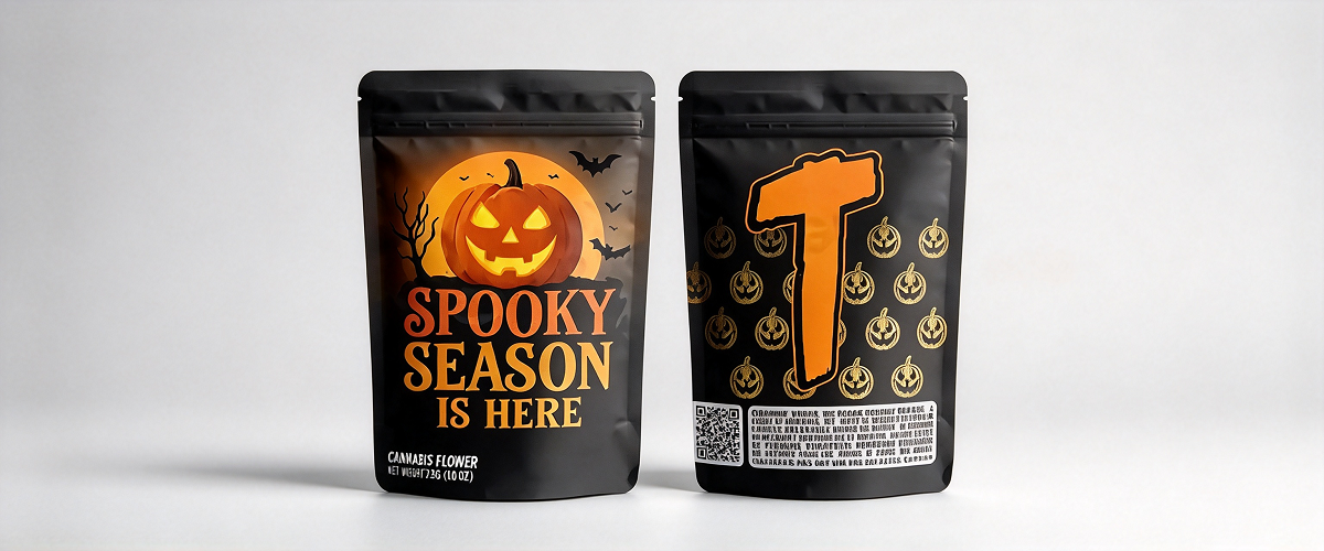
Custom flexible packaging can help brands create recognizable limited editions, support product launches, differentiate flavors, and build a cohesive visual identity across retail and digital channels. Its commercial value is strongest when the design connects seasonal excitement with a clear brand message and an appropriate product offer.
Build a Recognizable Seasonal Brand Identity
The purpose of seasonal packaging is not simply to make the product look different. It should make the product recognizable as part of the brand while communicating the Halloween theme.
A consistent system can include:
- A stable logo position.
- A familiar product-name layout.
- A defined seasonal color palette.
- A consistent illustration style.
- Repeated design elements across different products.
- A distinct visual marker for limited-edition items.
This approach is particularly useful for brands offering several Halloween products. Consumers can recognize the collection as a group, while color and illustration changes help distinguish individual flavors or sizes.
For example, a confectionery brand could retain its standard logo and product-name placement while introducing a different Halloween character for each flavor. The result is a coordinated collection rather than several unrelated designs.
Use Limited Editions to Create a Sense of Occasion
Limited-edition packaging gives consumers a reason to notice a familiar product during a seasonal period. Halloween-specific illustrations, color schemes, and messages can make an existing item feel timely without requiring a complete change to the product itself.
A limited-edition strategy may involve:
- A seasonal version of an established product.
- A Halloween multipack with assorted flavors.
- A gift-oriented pouch with premium finishing.
- A special design for a retailer or promotional event.
- A small seasonal pack intended for parties or trick-or-treating.
The packaging should communicate the special edition clearly without implying product benefits that do not exist. If a product differs only in packaging, the marketing language should not suggest that its ingredients or formulation have changed.
Design for Different Seasonal Buyer Groups
Halloween buyers are not one uniform audience. Packaging should reflect the needs and preferences of the intended customer.
| Buyer Group | Likely Packaging Priorities | Design Direction |
|---|---|---|
| Parents buying treats for children | Clear product information, approachable visuals, convenient pack sizes | Friendly characters, bright colors, easy-to-understand graphics |
| Young adults buying party snacks | Bold appearance, novelty, social sharing potential | High-contrast graphics, humor, memorable slogans |
| Premium gift buyers | Presentation, perceived quality, cohesive collection design | Refined typography, controlled metallic accents, sophisticated illustration |
| Retailers and seasonal merchandisers | Shelf visibility, product differentiation, clear variant identification | Strong front-panel hierarchy and coordinated ranges |
| E-commerce shoppers | Readable thumbnails, recognizable branding, clear product identity | Simple focal points and strong color contrast |
| Buyers seeking bulk treats | Pack size, product count, price clarity, storage convenience | Clear weight or quantity communication and practical bag formats |
These are general design considerations, not guarantees about consumer behavior. Actual preferences vary by market, age group, product category, and price point.
Use Packaging to Support Retail Merchandising
Halloween products often appear in seasonal displays, endcaps, promotional bins, or dedicated holiday sections. Packaging needs to remain recognizable when placed beside products from many competing brands.
A coordinated range can help create a stronger display. Repeated visual elements make products look connected, while contrasting colors help individual variants stand apart.
For example, a range of three Halloween snack flavors could share the same logo placement and headline style, while each flavor uses a different accent color and character. This creates visual unity without making every package identical.
The package should also be practical for the retailer. Bag dimensions, shelf stability, hanging features, and case-pack arrangements may affect how the products are displayed. These factors should be considered alongside artwork rather than treated as separate operational details.
Make Packaging Work in E-Commerce and Social Media
Halloween products are frequently promoted through product listings, online marketplaces, social media, and seasonal campaign pages. Packaging that reads clearly at small sizes can improve recognition across these channels.
The strongest visual elements should remain visible when the package is photographed against a neutral background. Brand name, product type, and the primary seasonal graphic should not depend on tiny details.
A practical digital-readiness checklist includes:
- Confirming that the front panel works as a small thumbnail.
- Photographing the finished package rather than relying entirely on a 3D mockup.
- Showing the bag's shape and closure in product images.
- Including a clear view of the product where transparency or product photography is appropriate.
- Keeping promotional copy consistent across the package, product page, and campaign materials.
A package with a distinctive character or memorable graphic may also become more recognizable in user-generated photos. However, social sharing depends on many factors beyond packaging design, including product quality, audience interest, price, and campaign execution.
Use Personalization and Variable Designs Where Practical
Digital printing and other suitable production methods can support short runs, multiple artwork versions, and certain forms of customization. This can be useful when brands want to test different Halloween designs, create retailer-specific packs, or introduce small limited-edition collections.
Possible approaches include:
- Different character illustrations for separate flavors.
- Several colorways within one seasonal range.
- Localized text for different target markets.
- Event-specific artwork for promotional campaigns.
- Small-batch designs for specialty stores or online launches.
The best production method depends on the quantity, artwork complexity, required print quality, material structure, and production schedule. Short-run printing may reduce the need for traditional plate-based setup in some cases, but the total cost per bag and available material options should still be evaluated.
Align Packaging with the Marketing Message
A Halloween package can reinforce a broader campaign through consistent visuals and messaging. If a brand's campaign focuses on sharing treats, the packaging could emphasize multipacks or easy-to-distribute portions. If the campaign focuses on premium gifting, the design might highlight presentation and collection value.
The message should be specific and credible. Avoid crowding the package with multiple slogans, discount claims, and decorative phrases. One clear seasonal message is often more effective than several competing ones.
Brands should also distinguish between front-of-pack promotional copy and required product information. Regulatory details should remain legible and available wherever applicable, even when the package has an elaborate Halloween design.
Extend the Value of Seasonal Artwork
A short selling season does not necessarily mean that all design work must be used for only a few weeks. Brands can plan a flexible artwork system that supports several sizes, flavors, or related holidays.
For example, a core illustration style might be adapted for Halloween, autumn promotions, and other seasonal campaigns by changing selected colors, characters, or supporting messages. This approach can reduce repeated design work and help maintain brand consistency.
However, designs should be planned carefully when packaging uses preprinted inventory. Large seasonal changes may leave unused bags after the holiday ends. Where demand is uncertain, brands can compare the cost of a large custom print run with the flexibility of smaller runs or a standard base design that uses seasonal labels or sleeves where technically suitable.
Evaluate Campaign Performance After the Season
Packaging performance should be evaluated through more than visual preference. Once the campaign is complete, brands can compare results such as:
- Sales of seasonal products against relevant historical periods.
- Performance of different package sizes or variants.
- Retailer feedback on shelf visibility and handling.
- Customer comments about design and usability.
- Product damage, seal failures, or quality complaints.
- Remaining inventory and packaging waste.
These results can inform the next seasonal campaign. A design that looks striking but leads to confusion about product flavor may need clearer product identification. A popular pouch that is difficult to open may benefit from a revised tear notch or closure.
Seasonal packaging is most valuable when creative decisions are connected to measurable commercial and operational outcomes.
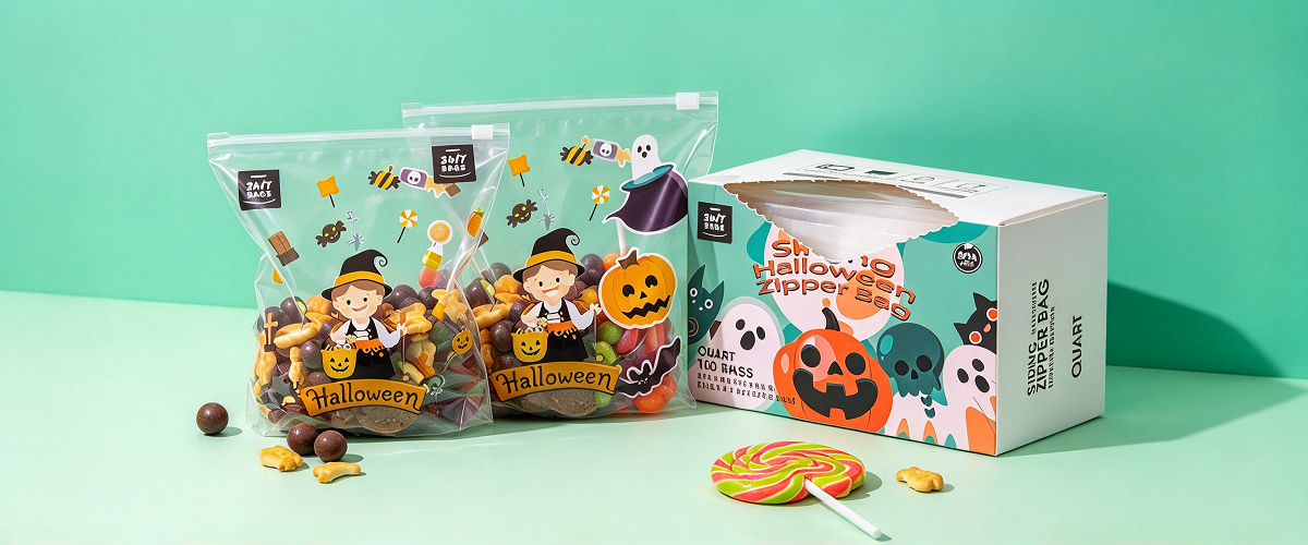
5. Halloween Flexible Packaging Design: Key Factors for Visual Appeal, Product Protection, and Seasonal Marketing
A successful Halloween packaging project requires coordination between design, packaging engineering, procurement, production, and marketing. Creative artwork is only one part of the process. Material selection, manufacturing constraints, regulatory requirements, production timing, and inventory planning all influence the final result.
The following factors can help brands develop packaging that looks appropriate for Halloween while remaining practical to manufacture and distribute.
Define the Product and Packaging Requirements First
Before selecting colors or illustrations, document the essential requirements of the product and the sales plan.
Useful questions include:
- What product will be packed?
- What is its moisture content and sensitivity to oxygen, light, or odor?
- Does it contain oil, chocolate, or ingredients that may affect packaging compatibility?
- What shelf life is required?
- Will the product be stored at ambient temperature, refrigerated, or frozen?
- Will it be sold individually, in multipacks, or as a gift set?
- Which countries or regions will receive the product?
- What filling and sealing equipment will be used?
- What is the expected order quantity?
- When must the finished bags arrive?
These questions establish the technical and commercial framework. They help prevent a common mistake: choosing a design first and discovering later that the selected bag format or material cannot meet the product's requirements.
Balance Visual Appeal with Product Protection
Halloween graphics should never replace a technically appropriate packaging structure. The package must protect the product during storage, retail handling, and transportation.
Depending on the product, the relevant factors may include:
Moisture barrier: Important for products that absorb moisture or lose crispness when exposed to humid conditions.
Oxygen barrier: Useful for products vulnerable to oxidation, including some oily snacks and products containing sensitive ingredients.
Light protection: Relevant for light-sensitive products whose color, flavor, or quality may deteriorate during exposure.
Aroma retention: Important when the product's characteristic smell is part of its quality or when external odors could affect it.
Puncture and abrasion resistance: Relevant for sharp-edged products, rough handling, and longer distribution routes.
Seal integrity: Essential for preventing leaks, contamination, and unwanted exposure to the environment.
The correct performance target should be established for the actual product and intended shelf life. A high-barrier structure may be unnecessary for some products, while a basic structure may be inadequate for others.
Plan the Artwork Around the Bag Structure
Artwork must be prepared for the actual bag dimensions and construction. A design that works on a flat rectangle may not translate perfectly to a stand-up pouch, flat-bottom bag, or gusseted structure.
The artwork file should account for:
- Front and back panels.
- Side gussets and bottom gussets.
- Seal areas and folds.
- Zipper position.
- Tear notches.
- Windows or other special features.
- Print-safe areas and bleed.
- Barcode and regulatory information.
- Registration and conversion requirements.
Important text and logos should not be placed too close to folds, seals, or trim lines. Decorative elements should also be checked across panel transitions so that illustrations do not appear unintentionally broken when the bag is assembled.
The packaging supplier should provide the appropriate dieline and artwork specifications before the designer finalizes the file.
Choose a Printing Method That Matches the Order
Different printing processes suit different production conditions. The best choice depends on order volume, design complexity, color requirements, lead time, and total cost.
| Printing Method | Potential Advantages | Key Considerations | Possible Use |
|---|---|---|---|
| Flexographic printing | Suitable for many repeat packaging jobs and efficient production at appropriate volumes | Setup, artwork preparation, and color consistency need to be considered | Larger seasonal orders and repeat designs |
| Rotogravure printing | Can support high-volume production and detailed graphics | Cylinder preparation can add upfront cost and requires production planning | Large-scale seasonal campaigns |
| Digital printing | Can be useful for shorter runs, artwork variation, and certain testing projects | Material availability, print specifications, and unit economics vary by supplier | Limited editions, small batches, and design testing |
There is no universal volume threshold at which one method is always superior. Brands should request quotations based on the same specifications, including bag dimensions, material structure, number of designs, quantity per design, finishing requirements, and delivery destination.
When several designs are required, clarify whether the supplier can combine production efficiently or whether each artwork version will incur separate setup or minimum-order requirements.
Verify Color and Finish on the Actual Material
Color reproduction can change according to substrate, ink system, lamination, and finishing. A Halloween design that depends on vivid orange or deep black should be evaluated on the intended material.
A useful approval process includes:
- Approve the artwork on the supplier's dieline.
- Confirm the color references and printing requirements.
- Review a digital proof for layout and content.
- Request a physical proof or production-representative sample when appropriate.
- Check the finished pouch for color, registration, finish, and readability.
- Approve mass production only after the agreed requirements are met.
The level of proofing should match the project's risk and complexity. A premium limited-edition launch with several finishes may need more careful review than a simple repeat order.
Select Convenient Opening and Resealing Features
Packaging convenience affects how consumers interact with a product after purchase. For Halloween treats intended for parties or repeated snacking, resealability may be useful. Single-serving products may prioritize easy opening and portion control instead.
Possible features include:
- Zippers: Useful for products intended to be consumed over multiple occasions.
- Tear notches: Help consumers initiate opening at a designated point.
- Easy-open structures: Can improve accessibility when designed and tested correctly.
- Hanging holes: May support specific retail displays.
- Transparent windows: Can reveal the product where visibility is beneficial.
- Handles: May be useful for certain larger gift or multipack formats.
Features should be selected based on the product, user experience, and cost. Every additional feature can affect production complexity, sealing, available print area, and the finished bag's performance.
Design for Safe and Reliable Sealing
A strong package design includes a practical sealing plan. Decorative artwork, zippers, and other features must not interfere with the sealing process.
Powders, crumbs, oil, or sugar crystals may contaminate the seal area during filling. Material selection and sealing parameters should account for the product and the packaging equipment.
Before large-scale production, check:
- Seal strength and consistency.
- Leakage or channel formation.
- Zipper functionality where included.
- Opening behavior at the tear notch.
- Resistance to handling and transportation.
- Compatibility with any gas-flushing or vacuum process used.
For food packaging, these checks should form part of the broader quality-control process rather than being treated as optional cosmetic inspections.
Plan the Seasonal Production Timeline
Halloween products have a fixed seasonal deadline. A delay in artwork approval, material procurement, printing, or shipment can reduce the time available for sales.
A practical project timeline should include:
| Project Stage | Main Activities | Key Output |
|---|---|---|
| Product planning | Confirm product, bag type, pack size, quantity, and destination market | Packaging specification |
| Design development | Create the theme, color palette, illustrations, and layout | Initial artwork |
| Technical review | Check dielines, materials, sealing, labeling, and production feasibility | Approved technical artwork |
| Proofing | Review color, legibility, finishes, and physical samples where needed | Approved proof |
| Production | Print, laminate where applicable, convert, and inspect bags | Finished packaging |
| Logistics | Confirm packing, shipping, customs requirements, and delivery dates | Packaging delivered to the filling site |
| Filling and launch | Conduct production checks, fill products, and prepare distribution | Sale-ready seasonal products |
Actual lead times depend on order quantity, material availability, printing method, supplier capacity, and shipping arrangements. Brands should obtain a realistic schedule from the supplier and establish internal approval deadlines.
It is also wise to plan backward from the date the finished product must reach the retailer or fulfillment center, not merely from the intended production start date.
Manage Minimum Order Quantities and Seasonal Inventory
Halloween packaging can create inventory risk because demand is concentrated within a limited period. Excess bags may be difficult to use after the season if the design includes a date, year, or strongly holiday-specific artwork.
Before ordering, evaluate:
- Expected product demand.
- Quantity per flavor or size.
- Minimum order requirements.
- The cost of producing several artwork versions.
- Remaining inventory from previous seasons.
- The possibility of reusing selected design elements.
- Storage conditions for unused packaging.
- The cost and environmental impact of obsolete inventory.
If sales forecasts are uncertain, consider whether a smaller print run, a simplified design system, or a flexible base package with seasonal graphics can meet the commercial goal. The most economical option depends on total cost, not only the unit price of the bag.
Consider Sustainability Without Compromising Performance
Sustainability is increasingly relevant to packaging decisions, but it should be approached with specific, verifiable criteria rather than broad claims.
Potential strategies include:
- Reducing unnecessary packaging layers or excess material where feasible.
- Optimizing bag dimensions to avoid overpackaging.
- Evaluating recyclable mono-material structures where suitable collection and processing systems exist.
- Selecting inks and adhesives according to the packaging design and applicable requirements.
- Avoiding decorative additions that complicate sorting or recycling when they provide little functional value.
- Designing the package to protect the product adequately and reduce avoidable product loss.
A structure described as recyclable is not necessarily recyclable in every location. Recyclability depends on the complete package construction, local collection and processing infrastructure, and applicable rules. Similarly, replacing a high-barrier laminate with a simpler material may not be appropriate if the product requires stronger protection.
Brands should request evidence for environmental claims and verify the suitability of the complete package before communicating those claims to consumers.
Review Labeling and Market Requirements
Halloween designs often use dark backgrounds, decorative lettering, and complex illustrations. These should not compromise required product information.
Depending on the product and destination market, the package may need to display:
- Product name and identity.
- Ingredient list.
- Allergen declarations.
- Net quantity.
- Nutrition information where required.
- Manufacturer or responsible business information.
- Country-of-origin information where applicable.
- Storage or handling instructions.
- Lot coding and date marking.
- Required warnings or other regulated statements.
Requirements vary by product category and market. Brands should confirm the applicable rules before artwork approval. The packaging supplier can help with technical print requirements, but the brand or responsible food business should ensure that the final label content is compliant.
Protect the Package During Shipping and Storage
Even well-designed packaging can be damaged by poor handling. Halloween bags may travel through several stages before reaching the filling facility or retail location.
Potential risks include abrasion, compression, moisture exposure, temperature variation, and damage to closures or bag edges. The shipping configuration should protect the printed surface and preserve the bags' dimensions and sealing areas.
For finished food products, distribution conditions may also affect product quality. Chocolate, for example, can be damaged by excessive heat even if the pouch itself remains intact. Packaging should therefore be considered as part of the entire distribution system, including secondary cartons, palletization, warehousing, and transport.
Build a Quality-Control Checklist for the Finished Package
A structured checklist helps ensure that the approved design is reproduced consistently.
| Inspection Area | What to Verify |
|---|---|
| Artwork | Correct version, spelling, logos, and required information |
| Color | Consistency with the approved reference |
| Print quality | Registration, clarity, smudging, and visible defects |
| Lamination and finish | Appearance, adhesion, and any agreed finishing requirements |
| Bag dimensions | Width, height, gusset, and tolerances |
| Seals | Integrity, consistency, and leakage performance where relevant |
| Functional features | Zipper, tear notch, window, valve, or handle as applicable |
| Food-contact documentation | Appropriate supplier documentation for the intended use |
| Packing and delivery | Correct quantity, protective packing, and identification |
| Production compatibility | Performance on the intended filling and sealing equipment |
The specific acceptance criteria should be agreed before production. Clear specifications reduce the risk of disputes and help suppliers and buyers evaluate quality consistently.
Compare Suppliers on Total Value, Not Just Price
For custom Halloween packaging, the lowest quotation does not always represent the lowest overall cost. Differences in material specification, print quality, production reliability, minimum order quantity, delivery terms, and quality assurance can affect the final result.
When comparing suppliers, review:
- Whether the material structure is fully specified.
- Whether the quote includes the required bag features and finishes.
- The minimum order quantity for each artwork version.
- Printing method and available proofing options.
- Production lead time and shipping assumptions.
- Quality-control procedures and documentation.
- Experience with the intended product category.
- Communication speed and artwork support.
- How defects or delivery problems will be handled.
A reliable supplier should be able to discuss both the visual design and the technical requirements. The goal is to produce a package that matches the approved artwork, protects the product, and arrives in time for the seasonal launch.
FAQ
What are the best colors for Halloween flexible packaging?
Orange and black are classic choices because they are strongly associated with Halloween. Purple, green, white, cream, red, and metallic accents can help create different moods or distinguish a brand from competitors. The best palette depends on the product, target audience, brand identity, and print requirements.
Which bag styles are most suitable for Halloween candy packaging?
Stand-up pouches are useful for retail candy bags and resealable treats. Pillow bags can suit high-volume candy and snack production, while three-side-seal pouches are useful for samples and small portions. Flat-bottom bags may suit premium confectionery or gift-oriented collections. The final choice should reflect pack size, production equipment, product protection, and cost.
Can Halloween packaging be customized with unique illustrations and brand colors?
Yes. Flexible packaging can support customized artwork, seasonal characters, brand-specific color palettes, product illustrations, and different designs for multiple flavors or sizes. The available printing options depend on the supplier, order quantity, material structure, and selected production method.
Is digital printing suitable for limited-edition Halloween packaging?
Digital printing can be useful for shorter runs, multiple artwork versions, and seasonal design testing. It may reduce certain setup requirements compared with traditional printing methods. However, cost, material compatibility, print quality, and available finishes vary by supplier, so brands should compare quotations based on the same specifications.
Should Halloween packaging include a transparent window?
A transparent window can help consumers see candy, cookies, snack mixes, or other visually appealing products. However, windows may reduce the area available for artwork and can affect light protection or barrier performance. The window should be selected according to the product's needs rather than used only for decoration.
How can brands make Halloween packaging look premium?
Premium Halloween packaging often uses a controlled color palette, clear typography, restrained illustrations, and selective finishes such as matte surfaces, spot UV, or metallic effects. Strong visual hierarchy and consistent brand identity are usually more important than adding numerous decorative effects.
How can Halloween packaging help increase seasonal sales?
Distinctive seasonal packaging can improve shelf recognition, make limited editions easier to identify, and support coordinated retail and digital campaigns. Sales results still depend on product quality, pricing, distribution, availability, and marketing execution. Brands should evaluate campaign performance after the season instead of assuming that a design change alone will increase sales.
How early should brands order custom Halloween packaging?
Brands should plan backward from the required delivery date of the finished product. Artwork approval, material procurement, proofing, printing, conversion, shipping, and any filling trials all need time. The exact schedule depends on the order quantity, printing method, supplier capacity, and destination, so it is best to confirm a project-specific timeline before launching production.
What material structure is best for Halloween snack packaging?
There is no single best structure for every snack. Chips and oily snacks may need stronger oxygen and moisture protection, while many sugar-based candies primarily need effective moisture control. The final laminate should be selected according to the product's composition, required shelf life, storage conditions, filling process, and applicable food-contact requirements.
Can Halloween packaging be designed with recyclable materials?
Some Halloween pouches can be developed using mono-material structures or other designs intended to support recycling. Whether a package is recyclable in practice depends on its full construction and the collection and processing systems available in the target market. Brands should confirm technical suitability and substantiate environmental claims before using them in marketing.
How can brands reduce leftover Halloween packaging after the season?
Brands can improve inventory planning by forecasting demand carefully, reviewing previous seasonal sales, controlling the number of artwork variations, and evaluating order quantities against minimum order requirements. A flexible design system or a smaller initial run may be appropriate when demand is uncertain, although the best choice depends on total production and logistics costs.
What should be checked before approving the final Halloween packaging design?
Check the artwork, brand identity, product name, required information, color reproduction, bag dimensions, seal areas, functional features, material specification, and production compatibility. Where appropriate, review a physical sample and run a filling or sealing trial. This helps confirm that the package is not only visually appealing but also practical and suitable for the product.
Conclusion
Designing effective Halloween-themed flexible packaging requires a balance between creativity and technical performance. Distinctive colors, memorable graphics, suitable typography, and carefully selected finishes can create a strong seasonal identity, while the right bag style and material structure help protect the product and support efficient production.
The most successful designs begin with a clear understanding of the product, target audience, and sales channel. Brands should establish a visual hierarchy, maintain recognizable brand elements, and use Halloween imagery with purpose rather than overcrowding the package. At the same time, material selection, sealing performance, food-contact compliance, artwork preparation, production scheduling, and inventory planning must be considered from the beginning.
For brands launching seasonal candy, snacks, coffee, confectionery, pet treats, or promotional products, customized flexible packaging can become an important part of the Halloween marketing strategy. When visual appeal, product protection, convenience, and manufacturing feasibility are planned together, packaging can do more than decorate a seasonal product—it can help create a cohesive brand experience that consumers recognize and remember.