How to Make Your Product Look More Premium Through Packaging
Anna_Yu
How to Make Your Product Look More Premium Through Packaging
Premium packaging is often one of the first signals consumers use to judge product quality. Before customers taste, touch, or use a product, they encounter its packaging, making visual presentation and physical experience important parts of perceived value. A well-designed package can make an ordinary product appear more sophisticated, trustworthy, and desirable, while poorly designed packaging can make even a high-quality product appear less competitive.
Flexible packaging offers brands a wide range of possibilities for creating a premium appearance. High-quality films, sophisticated printing, matte or gloss finishes, metallic effects, tactile textures, precise typography, and distinctive structures can all contribute to a stronger visual identity. At the same time, premium packaging should not sacrifice functionality. Barrier performance, sealing reliability, convenience, product protection, and sustainability remain essential considerations.
For emerging and established brands alike, the goal is not simply to make packaging look expensive. Effective premium packaging communicates the product's positioning clearly and creates a consistent experience between the brand, the package, and the consumer. By carefully combining materials, colors, graphics, finishes, and structural features, flexible packaging can increase perceived product value while supporting differentiation in competitive markets.
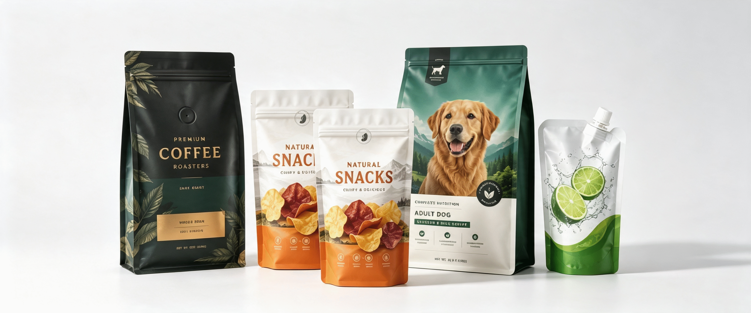
1. What Packaging Design Elements Make a Product Look More Premium?
Premium packaging begins with a clear understanding of what the target customer considers high quality. Luxury does not always mean complicated graphics, expensive materials, or excessive decorative effects. In many cases, premium packaging relies on simplicity, consistency, proportion, and carefully controlled visual details.
A successful premium package should make the product's value immediately understandable while creating a sense of confidence and quality.
Minimalist and Focused Design
One of the most effective approaches to premium packaging is visual simplicity.
Instead of filling every available space with graphics and information, premium packaging often uses carefully selected design elements. A clean layout can make the brand logo, product name, and key product benefit easier to recognize.
Minimalist design can include:
- Limited color palettes
- Generous negative space
- Clear visual hierarchy
- Simple graphics
- Controlled typography
- Carefully positioned product information
This approach can help a product look more sophisticated without necessarily increasing packaging complexity.
Strong Visual Hierarchy
A premium package should guide the consumer's attention naturally.
The most important elements may include:
- Brand name
- Product category
- Product variant or flavor
- Key selling point
- Supporting information
When every element has equal visual emphasis, the package can appear crowded. A strong hierarchy allows consumers to understand the product quickly.
Consistent Brand Identity
Premium appearance is strongly connected to consistency.
If a brand uses completely different colors, fonts, layouts, and visual styles across different products, it may become difficult for customers to recognize the brand.
A consistent packaging system can use:
- A recognizable logo
- Consistent typography
- Repeated design motifs
- Controlled color families
- Similar structural formats
- Consistent finishing techniques
This creates a cohesive product portfolio and strengthens brand recognition.
High-Quality Product Photography and Graphics
For food, beverages, cosmetics, and other consumer products, imagery can significantly influence perceived value.
High-resolution product photography, refined illustrations, and professionally designed graphics can make the package appear more sophisticated.
However, the visual style should match the product positioning. A premium organic food brand may benefit from natural photography and restrained colors, while a luxury confectionery brand may use metallic accents and elegant typography.
Tactile Experience
Premium packaging is not only about what consumers see.
The physical sensation of the package can also influence perception.
Matte films, soft-touch effects, textured surfaces, and carefully selected laminations can create a more sophisticated tactile experience.
This is particularly useful for products positioned as:
- Luxury foods
- Specialty coffee
- Premium tea
- Cosmetics
- Personal care products
- Gourmet snacks
- High-end confectionery
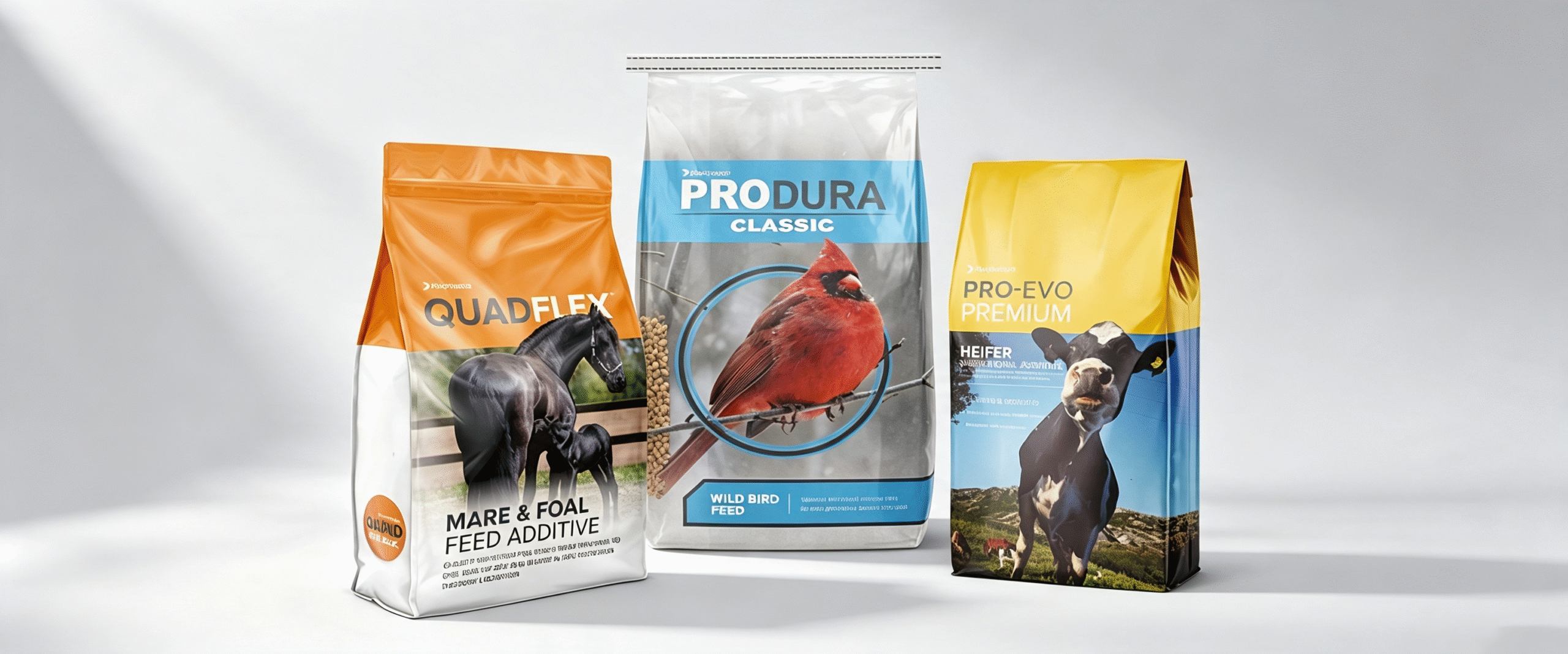
2. How Can Flexible Packaging Enhance Your Product’s Perceived Value?
Flexible packaging can contribute significantly to perceived product value because it combines visual customization with functional performance.
Compared with standard packaging formats, flexible bags and pouches provide a large printable surface and can accommodate many different structures and finishing options.
Large Printing Area
Stand-up pouches, flat-bottom bags, side-gusset bags, pillow bags, and other flexible formats can provide substantial printable surfaces.
This allows brands to communicate:
- Brand identity
- Product story
- Product benefits
- Ingredients
- Origin
- Certifications
- Usage instructions
A well-planned layout can transform the package itself into a strong marketing tool.
Premium Flexible Packaging Structures
Different material combinations can create different visual and functional experiences.
Common structures may include:
| Packaging Structure | Main Characteristics | Suitable Premium Applications |
|---|---|---|
| PET/PE | Good printability and sealing | Snacks, food products |
| PET/MPET/PE | High barrier and metallic appearance | Coffee, snacks, confectionery |
| PET/AL/PE | Excellent barrier performance | Premium coffee, specialty foods |
| BOPP/PE | Good print quality and moisture resistance | Snacks and dry foods |
| High-Barrier PE Structures | Functional and potentially recyclable | Sustainability-focused brands |
| Paper/PE or Paper/Barrier Laminates | Natural paper appearance | Organic and specialty products |
The final structure should be selected according to the product rather than appearance alone.
Premium Does Not Always Mean Expensive Materials
An important point for brands is that premium appearance does not necessarily require the most expensive packaging material.
A carefully designed conventional laminate can look highly sophisticated when combined with:
- Excellent typography
- Strong composition
- High-quality printing
- Controlled colors
- Appropriate finishing
This can allow emerging brands to create premium positioning without dramatically increasing packaging costs.
Functional Quality Supports Perceived Value
Consumers may associate packaging quality with product quality.
If a package looks attractive but has:
- Weak seals
- Poor opening performance
- Easy puncturing
- Unreliable zippers
- Excessive material wrinkles
the premium impression can quickly disappear.
Premium packaging should therefore combine aesthetics with dependable functionality.
Convenient Structures Add Value
Features such as resealable zippers, easy-tear openings, spouts, handles, and stand-up structures can improve the consumer experience.
For example, a premium coffee pouch with a resealable zipper and degassing valve can communicate both sophistication and functional expertise.
Likewise, a premium refill pouch can emphasize convenience and resource efficiency while maintaining an attractive appearance.
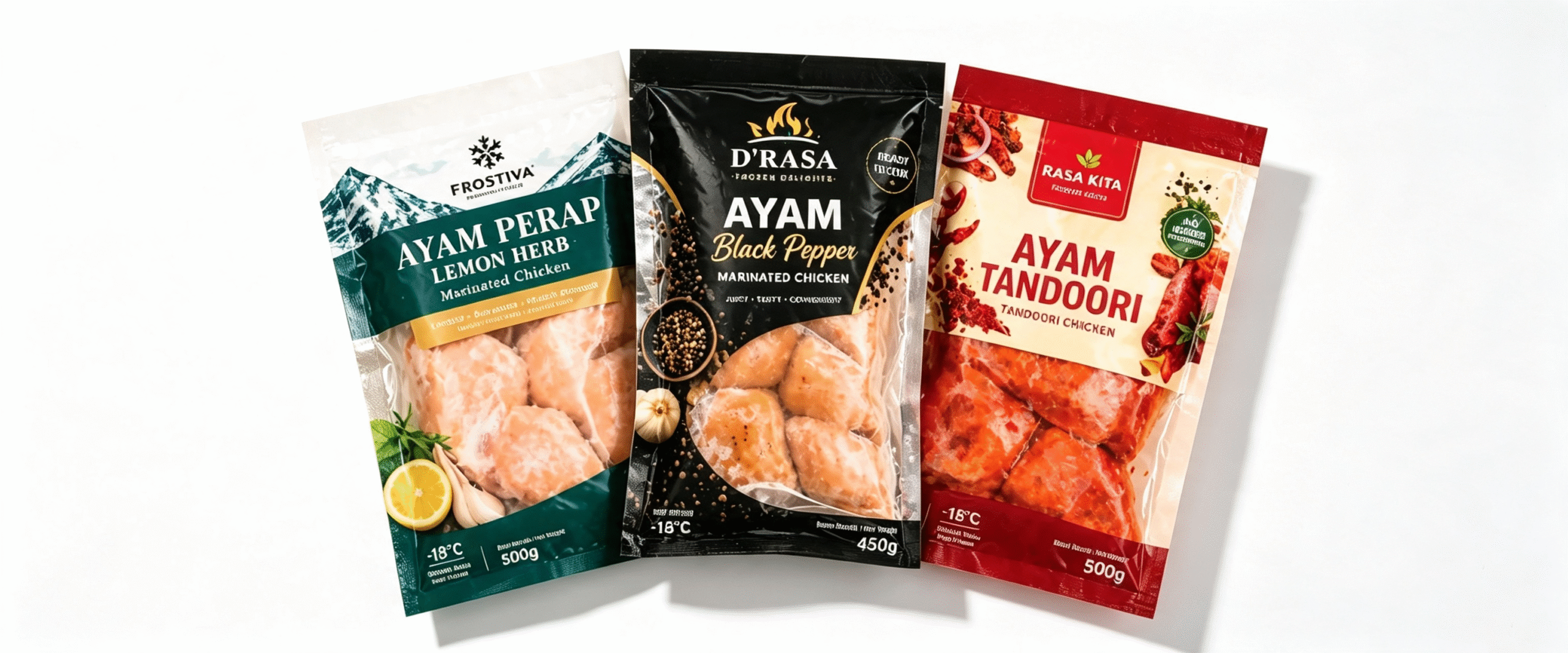
3. Which Materials and Finishing Techniques Create a High-End Packaging Experience?
Materials and finishing techniques can dramatically change how consumers perceive flexible packaging.
The right combination can create a package that looks refined, feels sophisticated, and communicates a clear market position.
Matte Finish
Matte packaging has become popular for premium products because it creates a soft, understated visual effect.
It can communicate:
- Sophistication
- Modernity
- Minimalism
- Natural positioning
- Luxury
Matte finishes are particularly suitable for coffee, tea, cosmetics, gourmet foods, and premium snacks.
Gloss Finish
Gloss finishes create a bright and reflective surface.
They can make:
- Colors appear more vivid
- Images look sharper
- Graphics attract attention
- Product photography stand out
Gloss packaging can be effective for colorful snack brands, confectionery, children's products, and products positioned around energy or freshness.
Matte and Gloss Combination
Combining matte and gloss effects can create visual contrast.
For example, a package can use a matte background while applying a gloss effect to:
- Logo
- Product name
- Key graphic
- Decorative pattern
This creates visual depth without requiring an overly complicated design.
Metallic Effects
Metallic finishes can communicate luxury and premium positioning.
Gold, silver, bronze, and other metallic effects can be incorporated into packaging designs for:
- Chocolate
- Coffee
- Tea
- Gourmet foods
- Premium snacks
- Confectionery
Metallic effects should be used strategically. Too many metallic elements can make a package look crowded rather than luxurious.
Spot UV Effects
Spot UV selectively creates glossy areas on an otherwise matte package.
This technique can highlight:
- Logos
- Icons
- Product names
- Patterns
- Illustrations
The contrast between matte and gloss can create a sophisticated visual and tactile effect.
Soft-Touch Effects
Soft-touch finishes are designed to create a smoother, more velvety surface sensation.
They can strengthen the perception of premium quality when the package is physically handled by consumers.
Embossed or Textured Effects
Textured effects can provide additional depth and differentiation.
For premium products, subtle textures may help reinforce a brand's identity.
Examples include:
- Paper-like textures
- Fabric-inspired patterns
- Geometric textures
- Natural textures
- Embossed logos
High-Quality Printing
Even sophisticated finishing techniques cannot compensate for poor printing.
Premium packaging should prioritize:
- Accurate color reproduction
- Fine graphic details
- Sharp text
- Consistent registration
- Controlled color management
High-quality printing provides the foundation for premium visual presentation.
Choosing Finishing Techniques Strategically
| Finishing Technique | Visual Effect | Best Use |
|---|---|---|
| Matte | Elegant and understated | Coffee, tea, luxury foods |
| Gloss | Bright and vibrant | Snacks, confectionery |
| Spot UV | Contrast and emphasis | Logos and key graphics |
| Metallic | Luxury and sophistication | Chocolate, coffee, premium foods |
| Soft Touch | Smooth tactile experience | Luxury consumer products |
| Embossing | Physical depth | Premium branding |
| Matte + Gloss | Visual contrast | High-end flexible packaging |
The most effective premium packages often combine one or two complementary finishing techniques rather than using every available effect.
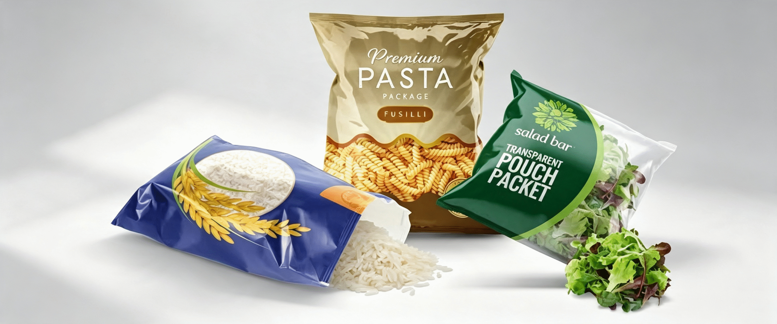
4. How Do Color, Typography, and Structural Design Influence Premium Product Packaging?
Color, typography, and package structure work together to shape the consumer's first impression.
A premium package should therefore be treated as a complete design system rather than a collection of individual decorative elements.
Color Selection
Color is one of the fastest visual signals consumers recognize.
Different colors can communicate different brand messages.
| Color Direction | Common Perception | Potential Applications |
|---|---|---|
| Black | Luxury, sophistication | Coffee, chocolate, cosmetics |
| White | Clean, modern, minimal | Premium foods, skincare |
| Deep Green | Natural, refined | Tea, organic foods |
| Dark Blue | Trust, sophistication | Specialty foods, beverages |
| Gold | Luxury, exclusivity | Chocolate, confectionery |
| Silver | Modern, technical | Functional and premium products |
| Earth Tones | Natural, authentic | Organic and sustainable brands |
Color selection should also reflect the product category and target market.
Typography
Typography is often underestimated in packaging design.
A premium product may use:
- Elegant serif fonts
- Modern sans-serif fonts
- Carefully designed display fonts
- Customized lettering
The key is not simply selecting an attractive font. Typography should remain readable at the actual package size.
A premium package can lose credibility if important information is difficult to read.
Brand Logo Placement
The logo should have enough visual space to remain recognizable.
Crowding the logo with other graphics can weaken its impact.
A strong premium layout often gives the brand identity sufficient negative space so it becomes a clear visual anchor.
Structural Design
The physical shape of the flexible package can also influence perceived value.
Possible structures include:
- Stand-up pouches
- Flat-bottom bags
- Side-gusset bags
- Box pouches
- Spout pouches
- Sachets
- Premium zipper bags
A distinctive structure can help a product stand apart from standard packages.
Proportion and Package Size
The relationship between package dimensions and product volume affects perception.
A package that is too large for the product can create an impression of inefficiency, while an appropriately proportioned package can look more intentional and premium.
Resealable and Functional Features
Functional features can also contribute to premium perception.
For example:
- High-quality zipper
- Easy-tear opening
- Degassing valve
- Spout
- Handle
- Reinforced bottom
These details can make consumers feel that the packaging has been thoughtfully designed around their needs.
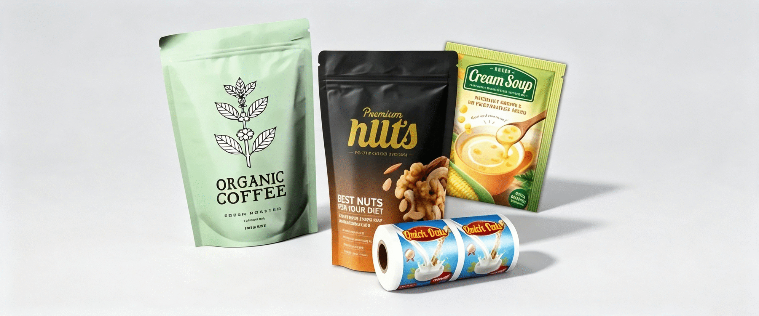
5. Premium Packaging Design: Key Factors for Branding, Shelf Appeal, and Customer Perception
Creating premium packaging requires more than adding expensive-looking visual effects. Brands should develop a complete packaging strategy that connects aesthetics, functionality, product protection, and market positioning.
Branding
Premium packaging should communicate a recognizable brand identity.
A strong packaging system can help customers identify a product quickly even from a distance.
Important branding elements include:
- Logo
- Color system
- Typography
- Graphic language
- Product naming
- Package structure
- Finishing style
Consistency across product lines can further strengthen brand recognition.
Shelf Appeal
Retail shelves are highly competitive environments.
A premium package should be recognizable within seconds and communicate the product category clearly.
Strong shelf appeal can come from:
- High contrast
- Distinctive colors
- Strong typography
- Clean composition
- Attractive imagery
- Unique package structure
However, visual differentiation should not compromise readability.
Customer Perception
Packaging can influence expectations before consumers interact with the actual product.
When a package communicates quality effectively, consumers may be more willing to consider:
- Higher price points
- Specialty positioning
- Premium product benefits
- Brand credibility
The package therefore becomes part of the value proposition.
Product Protection
Premium positioning requires reliable technical performance.
Depending on the product, packaging may need to provide:
- Moisture barrier
- Oxygen barrier
- Light protection
- Aroma retention
- Grease resistance
- Puncture resistance
- Strong seals
For food products, the correct barrier structure can be especially important because product deterioration can undermine the brand's premium promise.
Sustainability
Sustainability is increasingly becoming part of premium brand positioning.
Brands can consider:
- Lightweight packaging
- Recyclable structures
- Mono-material designs
- Reduced material usage
- Efficient package dimensions
- Responsible printing and finishing choices
However, sustainability claims should accurately reflect the actual packaging structure and available recycling systems.
Cost and Commercial Positioning
Premium packaging should still make commercial sense.
Brands need to consider:
- Packaging material cost
- Printing cost
- Finishing cost
- Minimum order quantities
- Production efficiency
- Shipping costs
- Expected retail price
- Target market
The objective is to create the highest perceived value possible without adding unnecessary packaging complexity.
Premium Packaging Decision Framework
| Factor | Key Question | Impact on Premium Positioning |
|---|---|---|
| Design | Does the package look distinctive and refined? | High |
| Materials | Does the structure provide appropriate performance? | High |
| Printing | Are graphics sharp and consistent? | High |
| Finishing | Does the finish reinforce the brand identity? | High |
| Structure | Is the package format distinctive and functional? | Medium to High |
| Convenience | Is it easy to open, use, and reseal? | High |
| Protection | Does it preserve product quality? | Very High |
| Sustainability | Does it support credible environmental goals? | Increasing |
| Cost | Is the premium appearance commercially viable? | Essential |
6. FAQ
What Makes Packaging Look Premium?
Premium packaging usually combines a clear visual hierarchy, high-quality printing, appropriate colors, refined typography, attractive materials, and carefully selected finishing techniques. Functionality and product protection also contribute to the perception of quality.
Does Premium Packaging Have to Be Expensive?
No. Premium appearance depends heavily on design quality and consistency rather than material cost alone. Strategic use of color, typography, layout, and finishing can create a sophisticated appearance without selecting the most expensive structure.
Which Flexible Packaging Materials Are Best for Premium Products?
PET, BOPP, metallized films, aluminum foil laminates, paper-based laminates, and high-barrier polymer structures can all be used for premium packaging. The best option depends on the product's barrier requirements, package format, appearance, and sustainability objectives.
Is Matte Packaging More Premium Than Gloss Packaging?
Not necessarily. Matte finishes often communicate understated luxury, while gloss finishes can create a vibrant and polished appearance. The better option depends on the brand identity and product category.
Can Flexible Packaging Look Like Luxury Rigid Packaging?
Yes. High-quality printing, metallic effects, matte finishes, soft-touch coatings, structured pouch formats, and carefully designed graphics can allow flexible packaging to achieve a sophisticated appearance comparable to many rigid formats.
How Can Packaging Increase Perceived Product Value?
Packaging can increase perceived value by communicating quality, differentiation, convenience, and brand credibility. A well-designed package can create stronger expectations about the product before consumers even try it.
Is Sustainable Packaging Compatible With Premium Design?
Yes. Recyclable and lightweight flexible packaging can be designed with sophisticated graphics, high-quality printing, and carefully selected finishes. Sustainability and premium positioning do not have to be mutually exclusive.
What Is the Most Important Element of Premium Packaging?
There is no single element that determines premium quality. The strongest results usually come from the integration of design, materials, functionality, product protection, finishing, branding, and consumer experience.
7. Conclusion
Making a product look more premium through packaging requires a strategic combination of visual design, material selection, finishing techniques, structural innovation, and functional performance. Premium packaging should communicate value immediately while creating a consistent experience when consumers see, touch, open, and use the product.
Flexible packaging provides significant opportunities in this area. PET, BOPP, metallized films, aluminum foil laminates, paper-based structures, and high-barrier polymer solutions can support different product requirements. Meanwhile, matte finishes, gloss effects, metallic details, spot UV, soft-touch surfaces, and other finishing techniques can strengthen visual and tactile appeal.
However, premium packaging is not simply about adding more decoration. The most effective designs use simplicity, consistency, functionality, and carefully selected details to communicate quality. Color, typography, structural design, package convenience, and barrier performance should work together rather than compete with one another.
For brands seeking to increase perceived product value, the ideal flexible packaging solution should balance premium aesthetics, product protection, consumer convenience, sustainability, and cost efficiency. When these elements are integrated effectively, packaging becomes more than a protective layer—it becomes a powerful brand asset that can strengthen shelf appeal, support premium positioning, and influence customer perception.